WoW Ramen
Konzeption und Gestaltung der Kommunikationsmedien für die Unternehmenspräsenz
der WoW Ramen Gmbh
2026
Logo
Jordan Adegbite
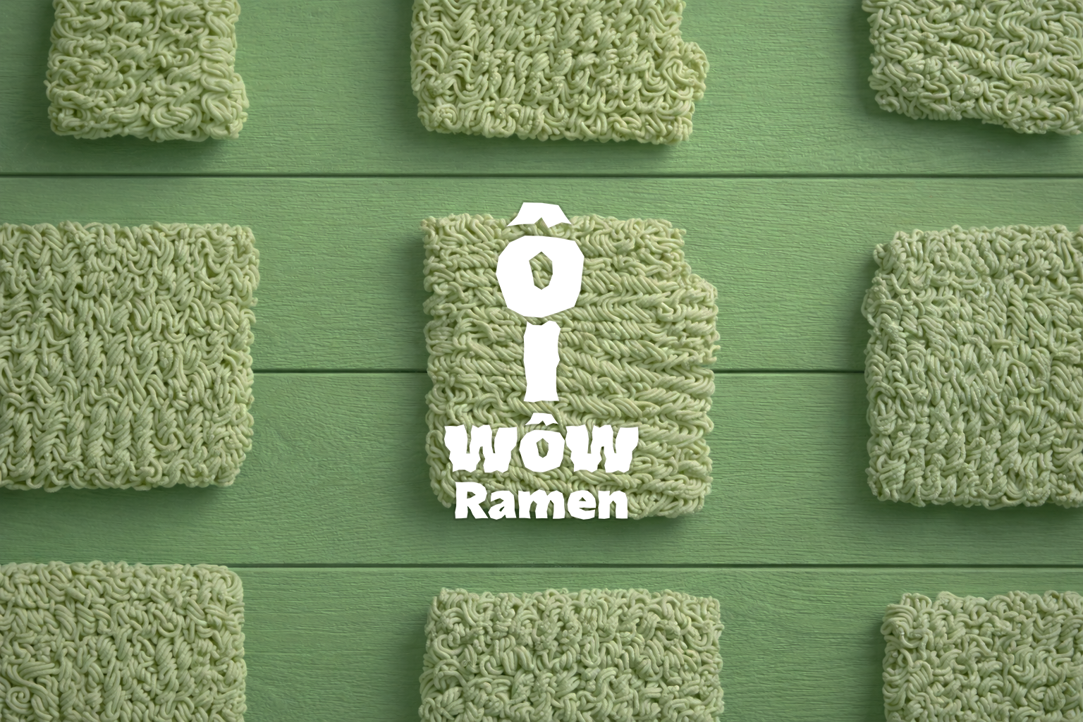
Ich wollte für WoW Ramen einen Auftritt entwickeln, der nicht über typische Asia-Restaurant-Klischees funktioniert, sondern über ein eigenständiges formales Detail.
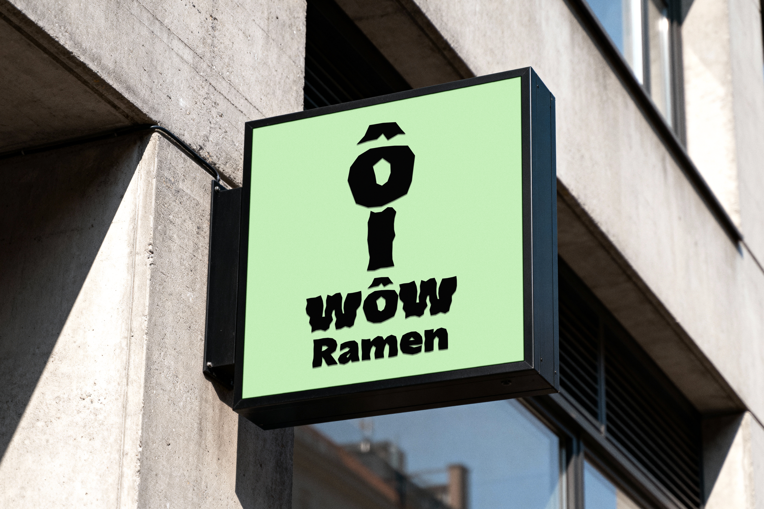
Die Marke richtet sich an Ramen-Feinschmecker, die nicht nur auf das Essen, sondern auch auf Atmosphäre und visuelle Eigenständigkeit achten.
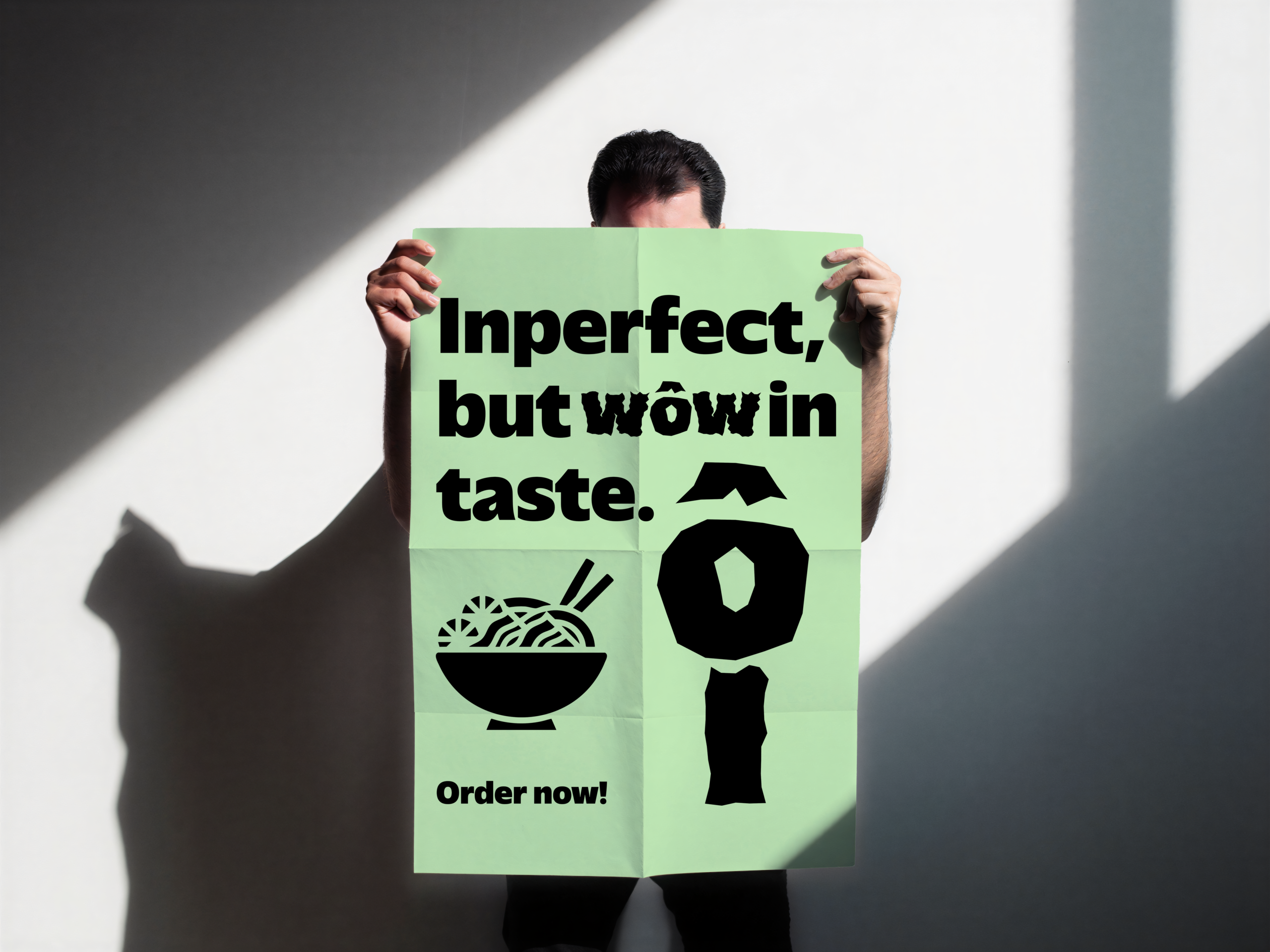
Ausgangspunkt war die abstrakte und ästhetische Verwendung des „ô“ aus Tabehôdai. Dieses Zeichen habe ich als zentrales Formmotiv ins Logo übernommen und daraus eine visuelle Klammer für den Auftritt gebaut. Die Gestaltung sollte bewusst roh und unperfekt wirken, damit die Marke direkter, charaktervoller und weniger glatt erscheint.
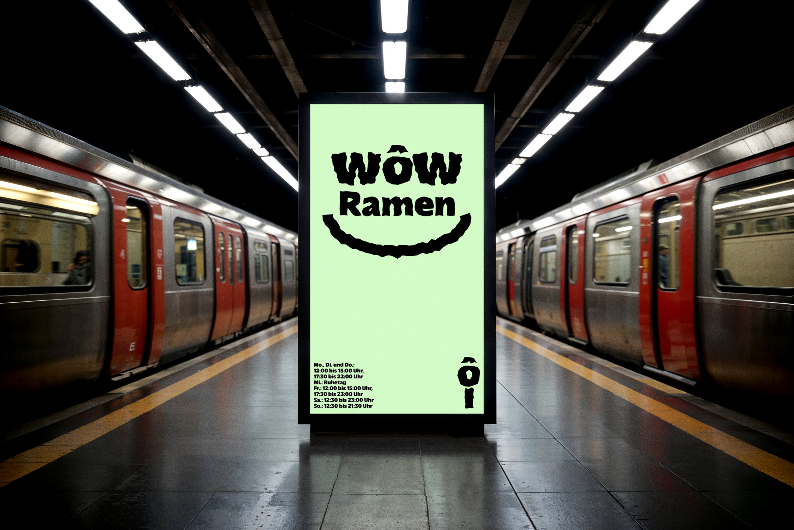
Entstanden ist ein reduzierter Markenansatz mit Logo und ersten Werbemitteln, der über ein einziges prägnantes Zeichen Wiedererkennbarkeit aufbaut.